
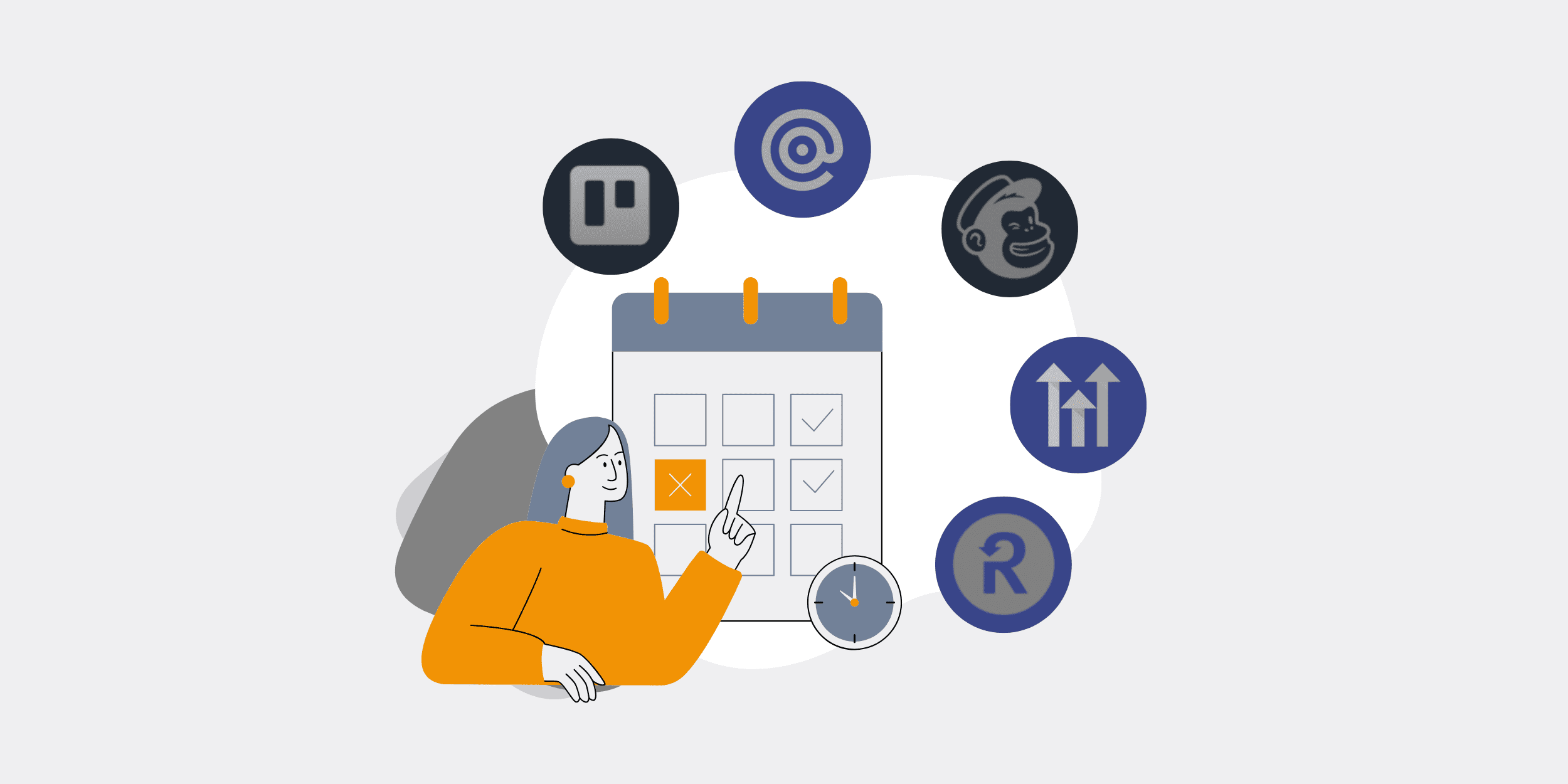
How to Use ATS Analytics for Data-Driven Hiring: A Step-by-Step ROI Framework
Your ATS is already collecting everything you need to hire faster, cheaper, and better. The data on your sourcing channels, funnel conversion rates, candidate drop-off points, and offer acceptance patterns is sitting in your system right now — unqueried. This guide shows you how to build a structured analytics practice that converts that dormant data into measurable hiring ROI, and then closes the loop by feeding insights back into your automation workflows. For the broader strategic context, start with our ATS automation consulting strategy guide.
Before You Start: Prerequisites, Tools, and Realistic Time Expectations
Before you pull a single report, confirm these foundations are in place or your analytics output will be unreliable from the start.
- Consistent field population: If recruiters skip source fields, stage disposition codes, or rejection reasons, your funnel data is incomplete. Run a data completeness audit first — pull the last 90 days of candidate records and calculate what percentage have all five core fields populated.
- Access to HRIS retention data: Quality-of-hire analysis requires first-year retention and performance ratings, which live in your HRIS, not your ATS. Confirm you can join these datasets before committing to quality metrics.
- Stakeholder alignment on KPI definitions: “Time-to-fill” means different things to different teams. Lock in your definitions in writing before building dashboards.
- Time investment: Initial audit and baseline — 3 to 5 business days. Dashboard build — 1 to 2 weeks depending on platform. Ongoing maintenance — 2 to 4 hours per month once automated.
- Risk to flag: Analytics without process change is theater. If leadership will not act on what the data reveals — particularly on sourcing budget reallocation or bottleneck resolution — this exercise will not generate ROI.
Step 1 — Audit Your Current ATS Data Architecture
Before drawing conclusions, confirm you have reliable data to draw from.
Pull the last 90 days of candidate records and calculate field completeness rates for the five fields that drive every downstream metric: application source, current stage, stage disposition (why they moved or exited), recruiter assigned, and offer outcome. Any field below 80% completeness will distort your funnel analysis.
Common gaps at this stage: source fields left blank because recruiters skip dropdown selection, stage disposition codes set to a generic “other” category, and rejection reasons missing entirely. These gaps are not a technology failure — they are a process failure. Correct them with a two-step fix: add required-field validation in your ATS configuration and run a 30-minute team calibration session on correct disposition coding.
Gartner research consistently identifies data quality as the primary failure point in HR analytics initiatives. Fix the input before building the output.
Output of this step: A field completeness scorecard with a list of specific gaps to resolve before proceeding.
Step 2 — Define Your Core Hiring KPIs Before Building Any Report
Reports built without pre-defined KPIs answer no one’s actual questions.
Lock in five to seven metrics that directly connect recruiting activity to business outcomes. The non-negotiable five:
- Time-to-fill: Days from job requisition approval to accepted offer. Measured by role family and hiring manager.
- Cost-per-hire: Total recruiting spend (job boards, agency fees, recruiter time, assessment tools) divided by number of hires. SHRM research puts the average at $4,129 — your internal benchmark matters more than the industry average.
- Source-of-hire quality ratio: Hires from each channel divided by their 12-month retention rate. This is the metric that changes budget conversations.
- Offer acceptance rate: Accepted offers divided by total offers extended. Below 80% signals a compensation, process, or employer brand problem.
- First-year retention by source: Which channels produce employees who stay? This requires HRIS data joined to ATS source records — and it is the most powerful metric in the set.
Document each definition in a shared reference document. Every stakeholder must use the same calculation methodology or your QBR conversations will collapse into definitional arguments rather than decisions.
Output of this step: A locked KPI glossary with formulas, data owners, and reporting cadence.
Step 3 — Map and Measure Your Recruiting Funnel
Stage-by-stage conversion rates reveal where your pipeline is leaking — and they are almost always surprising.
Pull conversion rates for every stage in your hiring process across all active roles for the past 90 days. Calculate: applications → phone screens → first interviews → second interviews → offers → acceptances. For each transition, calculate the percentage that advanced and the percentage that exited — and segment exits by whether the candidate withdrew or was rejected by the company.
Any stage where more than 40% of candidates exit without progressing is a bottleneck that deserves an immediate root-cause session. The most common findings:
- Application-to-screen drop-off: Usually caused by a lengthy application form, slow response time, or misaligned job description expectations. McKinsey research notes that top candidates are frequently off the market within 10 days of beginning their search — application friction compounds this.
- Assessment-to-interview drop-off: An assessment that is too long, poorly timed, or not clearly connected to the role will cause qualified candidates to abandon. Asana’s Anatomy of Work data shows knowledge workers already spend significant time on process-heavy tasks that feel disconnected from their actual work — candidates experience the same friction in long hiring processes.
- Offer-to-acceptance drop-off: Compensation misalignment or a competitor moving faster. Both are diagnosable from ATS data when you capture withdrawal reasons consistently.
For deeper guidance on how automated workflows can directly address funnel drop-off, see our piece on automated ATS workflows that improve candidate experience.
Output of this step: A funnel conversion waterfall chart by stage, with the top two bottlenecks ranked by volume impact.
Step 4 — Score Every Sourcing Channel
Volume is not value. Score each channel on the three dimensions that matter — and reallocate accordingly.
Build a sourcing channel scorecard with three columns: cost-per-hire, quality-of-hire (defined as 12-month retention rate of hires from that source), and time-to-fill. Assign each channel a score of 1 to 3 on each dimension. Any channel scoring below 2 on at least two of three dimensions should be reduced or eliminated from your budget in the next cycle.
The pattern we consistently observe: broad job aggregators generate the most applications but underperform on quality and time-to-fill. Employee referrals and targeted niche boards generate fewer applications but dramatically better quality ratios. Forrester research on HR technology investments reinforces that sourcing spend optimization is one of the highest-ROI levers available without adding headcount.
The MarTech 1-10-100 rule applies directly here: fixing a bad sourcing decision at the channel-selection stage costs a fraction of what it costs to onboard, develop, and eventually replace a poor-fit hire. Labovitz and Chang’s research framework, cited in MarTech, establishes that data quality costs compound exponentially the later they are caught in a process.
This analysis connects directly to the 9 key ATS automation ROI metrics that quantify hiring efficiency at the business level.
Output of this step: A ranked sourcing channel scorecard with a recommended budget reallocation for the next quarter.
Step 5 — Segment Analytics for DEI Visibility
DEI metrics belong in the same operational dashboard as efficiency metrics — not in a separate quarterly report that no one acts on.
Add demographic progression overlays to your funnel data. For each stage transition, calculate whether candidates from underrepresented groups progress at the same rate as the overall candidate pool. A disproportionate drop-off at a specific stage is a signal worth investigating — it may indicate a structured interview question that disadvantages certain backgrounds, an assessment tool with adverse impact, or a screening filter that is functionally biased even when nominally neutral.
Harvard Business Review research on hiring bias consistently finds that structured, criteria-based evaluation reduces demographic disparity in progression rates. ATS analytics makes those disparities visible in real time rather than discoverable only in a retrospective audit.
For a detailed framework on identifying and correcting algorithmic bias in your hiring process, see our guide on stopping algorithmic bias in ATS hiring.
Output of this step: A demographic funnel progression report identifying any stage with a statistically meaningful gap in progression rates between candidate groups.
Step 6 — Build Automated Reporting Dashboards
If generating insight requires a human to pull a report, it will not happen consistently. Automate the delivery.
Connect your ATS reporting layer — either via native reporting tools or a BI integration — to a live dashboard that updates automatically and delivers role-specific metrics to each stakeholder on a defined cadence:
- Weekly (hiring managers): Their own pipeline velocity — applications received, screens scheduled, interviews booked, offers pending. Compared to role benchmark.
- Weekly (recruiters): Time-in-stage alerts for candidates sitting longer than threshold in any stage.
- Monthly (HR leadership): Cost-per-hire, source quality ratios, offer acceptance rates, DEI funnel progression.
- Quarterly (executive leadership): First-year retention by source, time-to-fill trends, total recruiting spend versus budget.
Parseur’s Manual Data Entry Report documents that manual data handling costs organizations an average of $28,500 per employee per year in lost productivity. Every hour a recruiter spends building a manual report is an hour not spent on candidate engagement or sourcing. Automate the data delivery entirely.
For the mechanics of connecting ATS data to downstream systems, our ATS-HRIS integration guide covers the data flow architecture in detail.
Output of this step: Live dashboards auto-delivered to each stakeholder tier on a fixed cadence, with zero manual pull required.
Step 7 — Close the Loop: Convert Insights Into Automation Triggers
Analytics generates ROI only when bottlenecks in the data trigger automatic corrections in the process.
For every bottleneck your funnel data identifies, build a corresponding automation trigger in your recruiting workflow. This is the step that separates a reporting exercise from a talent ROI engine. Examples:
- Bottleneck: Candidates wait an average of 3.8 days for a phone screen invitation. Trigger: Automated scheduling link sent within 24 hours of application advancing to screen stage.
- Bottleneck: 38% of candidates exit after receiving an assessment. Trigger: Automated check-in message sent 48 hours after assessment delivery with a direct contact for questions.
- Bottleneck: Offer acceptance rate drops to 71% in Q3. Trigger: Automated alert to HR leadership when offer acceptance rate falls below 78% in any rolling 30-day window.
Your automation platform handles the trigger logic. Your ATS analytics identifies which triggers are worth building. The two systems work as a feedback loop — not as separate tools with separate owners.
For a broader view of how this analytics-to-automation loop compounds across the full talent operation, see our analysis of post-go-live ATS metric tracking.
Output of this step: A trigger map pairing each identified bottleneck with a specific automated workflow response, with ownership and SLA defined.
How to Know It Worked
Measure against your Step 2 baselines at 30, 60, and 90 days post-implementation:
- Time-to-fill decreasing quarter-over-quarter in the role families where you resolved bottlenecks.
- Cost-per-hire declining as budget shifts from underperforming sourcing channels to high-quality ones.
- Offer acceptance rate at or above 80% — a signal that process speed and employer brand friction have been addressed.
- Dashboard adoption rate above 70% among hiring managers — measured by login frequency if your platform supports it.
- Manual reporting hours reduced to near zero — if recruiters are still pulling manual exports weekly, the automation build is incomplete.
Common Mistakes and How to Avoid Them
Mistake 1: Building dashboards before fixing data quality. Analytics built on incomplete source fields or inconsistent disposition codes will produce confident-looking charts that point in the wrong direction. Run the Step 1 audit first, every time.
Mistake 2: Sharing aggregate metrics with hiring managers. Company-wide conversion rates do not create accountability. Role-specific and manager-specific metrics do. Segment every dashboard by the individual who controls the bottleneck.
Mistake 3: Treating DEI analytics as a separate workstream. When DEI metrics live in a separate quarterly deck, they stay aspirational. When demographic progression rates are visible in the same operational dashboard as time-to-fill, they become actionable.
Mistake 4: Stopping at the report. Insight without an automated trigger is just documentation of a problem. Every bottleneck finding must produce a corresponding workflow change or it will reappear in next quarter’s data.
Mistake 5: Ignoring first-year retention as a sourcing metric. Cost-per-hire tells you what a channel costs to use. First-year retention tells you what a channel costs to rely on. The second number is always larger and almost always ignored.
Next Steps
ATS analytics is the diagnostic layer of a high-performance talent operation — but the treatment is automation. Once your data reveals where the process breaks down, your automation workflows fix it without adding headcount or extending timelines. For a full picture of how both systems compound, explore 11 ways automation saves HR 25% of their day and our forward-looking analysis of the AI-driven future of ATS and talent strategy.
If you want to apply this framework to your specific ATS environment, the OpsMap™ diagnostic is designed to surface your highest-impact analytics and automation opportunities in a single structured engagement — and build the trigger logic that converts data into results.


