

Post: Consolidate Backup Alerts: Build a Monitoring Dashboard
How to Build a Simple Dashboard to Monitor All Your Automated Backup Alerts in One Place: A Step-by-Step Guide
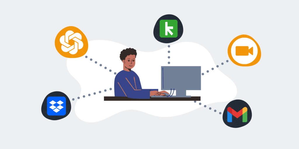
In the modern business landscape, automated backups are not a luxury but a fundamental necessity for business continuity. However, merely having backups isn’t enough; you need to know they’re happening successfully and be immediately alerted to any failures. When your critical systems like Keap, HighLevel, or various integrations through Make.com generate separate alerts, tracking them manually can become a chaotic, error-prone endeavor. This guide outlines a practical approach to consolidate these vital notifications into a single, intuitive dashboard, ensuring you have a real-time, unified view of your data integrity without the operational overhead. A centralized dashboard transforms scattered alerts into actionable insights, providing peace of mind and significantly reducing response times when issues inevitably arise.
Step 1: Define Your Monitoring Scope and Alert Sources
The first crucial step is to clearly identify which automated backup systems and processes you need to monitor. This goes beyond just knowing what’s being backed up; it involves understanding where alerts originate. For instance, if you’re using Keap, do you have a specific automation that notifies you of successful or failed CRM data exports? For HighLevel, are you monitoring database replication status or third-party backup service reports? Extend this to any low-code automation platforms like Make.com that might be orchestrating these backups, as they often generate their own execution logs or error notifications. Document each system, the type of alert it generates (success, warning, failure), and the current method of notification (email, Slack, internal log). This comprehensive inventory forms the foundation for data ingestion into your dashboard.
Step 2: Choose Your Dashboarding Platform and Data Repository
With your alert sources defined, the next decision is the technology stack. For a simple and cost-effective solution, consider platforms like Google Looker Studio (formerly Data Studio) or Microsoft Power BI, which offer robust visualization capabilities and often have free tiers or are included with existing subscriptions. These tools can connect to various data sources, making them ideal for consolidation. For a data repository, a simple Google Sheet or an Airtable base can serve as an excellent intermediary. For more advanced needs, a lightweight database like PostgreSQL or MySQL might be appropriate. The key is to select a platform that is accessible to your team, has connectors for your chosen data repository, and provides the flexibility to create custom visualizations that truly serve your monitoring needs.
Step 3: Establish Data Ingestion Pathways for Alerts
This step is about getting the alert information from its source into your chosen data repository. For systems that send email notifications, you can use automation tools like Make.com to parse these emails and extract key data points (e.g., status, system, timestamp, error message). Webhooks are often the most efficient method; if your backup services or automation platforms support them, configure them to send data directly to a Make.com scenario, which can then format and write the data to your Google Sheet or database. Even API calls can be leveraged to pull status updates from systems that don’t push notifications. The goal here is to standardize the incoming data into a consistent format, making it easy for your dashboard to interpret and display, ensuring all relevant backup events are captured.
Step 4: Design Your Dashboard Layout and Key Metrics
A well-designed dashboard is intuitive and provides critical information at a glance. Start by sketching out the layout. What’s the most important information? Likely an overall “health status” widget, followed by a list of recent alerts. Consider different sections for different types of alerts (e.g., Keap backups, HighLevel snapshots, Make.com scenario failures). Key metrics should include: total number of alerts in the last 24 hours, count of failed backups by system, average time to resolve a backup issue, and a chronological log of all events. Use clear, concise labels and avoid clutter. The design should prioritize readability and immediate understanding, enabling you to quickly identify any emerging patterns or persistent issues that require your attention.
Step 5: Configure Visualizations and Interactive Elements
Now it’s time to bring your raw data to life within your chosen dashboarding platform. Utilize different visualization types to effectively communicate your metrics. A “scorecard” showing the number of failed backups today is highly impactful. A bar chart can display failed backups per system, while a line chart might show the trend of alerts over time. Use conditional formatting to highlight critical information – green for success, red for failures, and yellow for warnings. Implement date filters to allow users to view data from specific periods, and enable drill-down capabilities where appropriate. Interactive elements transform a static report into a dynamic tool, allowing users to explore data more deeply and gain nuanced insights into the health of their automated backup processes.
Step 6: Implement Testing, Refinement, and Access Control
Before rolling out your dashboard, thorough testing is paramount. Trigger dummy alerts for each system to ensure they are correctly ingested and displayed on the dashboard. Verify that all visualizations are accurate and that filters work as expected. Gather feedback from potential users; what information do they find most useful? Is anything unclear? Based on this feedback, refine your layout, metrics, and data processing. Finally, establish appropriate access controls. Only authorized personnel should be able to view sensitive backup status information. Ensure that your dashboard is secure and that data privacy is maintained, aligning with your company’s broader data governance policies.
Step 7: Automate Reporting and Continuous Improvement
To maximize the value of your dashboard, consider automating regular reports. Most dashboarding platforms allow you to schedule email delivery of key dashboard views to relevant stakeholders (e.g., daily summary of backup statuses to IT leads, weekly trends to management). This ensures that even those who don’t frequently check the dashboard stay informed. Beyond reporting, view your dashboard as a living tool. Regularly review its effectiveness. Are there new backup systems to integrate? Do existing metrics still provide value? As your business evolves and your automation strategies expand, so too should your monitoring dashboard, ensuring it remains a robust and relevant tool for maintaining business continuity.
If you would like to read more, we recommend this article: Automated Alerts: Your Keap & High Level CRM’s Shield for Business Continuity


RELATED POST

")