9 Proactive HR Metrics That Drive Strategic Business Value in 2026
Proactive HR metrics are leading workforce indicators — flight risk scores, skill coverage ratios, quality-of-hire — that surface problems before they become vacancies, skill gaps, or disengagement crises. The 9 metrics below give HR teams the data they need to shift from reporting what went wrong to preventing what comes next.
Every HR team measures something. The question is whether those measurements tell you what already happened or what is about to happen. Reactive metrics — turnover rate, time-to-fill, absenteeism counts — are autopsies. They confirm the cost after it has landed. Proactive metrics are early-warning systems. They give decision-makers an actionable window before a workforce problem becomes irreversible.
This post covers the 9 proactive HR metrics that consistently separate administrative HR functions from strategic ones. For each metric, you’ll find a definition, what it predicts, and how automation makes it measurable at scale. If you’re building the data foundation that makes these metrics possible, start with the guide to fixing broken HR operations for small teams — clean data is the prerequisite for everything below. For the broader strategic framework, see our resource on HR transformation through practical AI and automation. Teams that want to understand how automation accelerates metric computation will also benefit from reviewing how non-technical HR teams build their own automations with Make and AI.
Quick Reference: 9 Proactive HR Metrics at a Glance
| Metric | Type | What It Predicts | Review Cadence |
|---|---|---|---|
| Flight Risk Score | Retention | Voluntary departures 60–90 days out | Monthly |
| Quality-of-Hire | Talent Acquisition | Long-term performance and retention by source | 90-day and 1-year |
| eNPS Trend Line | Engagement | Employment proposition strength or erosion | Quarterly |
| Skill Coverage Ratio | Capability | Future delivery gaps on strategic initiatives | Semi-annual |
| Workforce Demand Forecast | Planning | Headcount needs 6–18 months out | Quarterly |
| Internal Mobility Rate | Development | Career stagnation and top-performer retention risk | Semi-annual |
| Manager Effectiveness Score | Leadership | Team-level attrition and engagement decline | Bi-annual |
| Time-to-Productivity | Onboarding | Ramp quality by role, cohort, and hiring manager | Per cohort |
| Compensation Equity Index | Retention / Compliance | Attrition risk and regulatory exposure | Annual |
What Makes an HR Metric “Proactive”?
A metric is proactive when it is a leading indicator — a data signal that precedes and predicts a workforce outcome — rather than a lagging indicator that confirms what already occurred. Turnover rate is a lagging indicator. A flight risk score derived from engagement trends, tenure, compensation history, and manager relationship signals is a leading indicator. The distinction is not semantic: lagging indicators report the cost; leading indicators give you time to prevent it.
Proactive metrics are also instrumented, not speculative. They are built on real workforce data, analyzed against historical patterns, and refreshed on a schedule that preserves an actionable intervention window. Automation is what makes that refresh schedule sustainable — without automated data pipelines, analysts spend their time reconciling records rather than detecting patterns. The same logic that drives the hidden cost of manual data entry applies directly to HR metrics infrastructure.
Expert Take
The shift from reactive to proactive metrics is not a technology problem — it is a data discipline problem. Organizations that invest in automated, consistently defined data pipelines find that leading indicators emerge naturally from the data they already collect. The barrier is not access to sophisticated tools; it is the unglamorous work of ensuring every system uses the same field definitions, the same employee identifiers, and the same refresh cadence. Get that right and the predictive layer builds itself.
Which 9 Metrics Belong in a Proactive HR Dashboard?
1. Flight Risk Score
A flight risk score is a composite leading indicator that aggregates multiple signals — below-median compensation versus market, engagement survey quartile, time since last promotion, manager team-turnover history, and tenure relative to role lifecycle — into a single per-employee attrition probability. It predicts voluntary departures 60–90 days before they occur.
The strategic value is the intervention window. A manager who knows three of their eight direct reports carry elevated flight risk scores can have retention conversations, explore internal mobility options, or flag compensation anomalies before those employees have already accepted competing offers. Without the score, the manager finds out when the resignation letter arrives.
Flight risk scoring requires integrated data from your HRIS, performance platform, and compensation system. Automated data pipelines — the kind detailed in our guide to HRIS required fields versus manual data validation — are what make monthly score refreshes operationally realistic for lean HR teams.
2. Quality-of-Hire
Quality-of-hire measures the performance, engagement, and retention of a new employee at 90 days and at one year, then traces those outcomes back to the source channel, recruiter, and hiring manager who originated the hire. Time-to-fill and cost-per-hire are backward-looking counts. Quality-of-hire is forward-pointing — it tells you which acquisition inputs produce the best long-term workforce outcomes so you can replicate them.
This metric directly answers a question that matters to the CFO: are we spending recruiting budget where it generates the highest return? A sourcing channel that fills roles in 18 days but produces hires who leave before 12 months is more expensive than a channel that takes 30 days and produces hires who stay three years. Quality-of-hire makes that comparison visible.
See how this connects to financial outcomes in our framework for recruiting automation and measurable ROI.
3. eNPS Trend Line
Employee Net Promoter Score (eNPS) trend lines, pulse survey sentiment trajectories, and voluntary turnover segmented by performance quartile are proactive engagement metrics. The operative word is “trend.” A single eNPS score describes a moment. An eNPS trend line over six quarters reveals whether the employment proposition is strengthening or eroding — and in which parts of the organization.
Segment eNPS by department, manager, tenure band, and role level to surface localized deterioration before it spreads. An organization-wide eNPS that looks stable can mask a single division in freefall. The trend line by segment gives HR the specificity required to act before attrition confirms the problem.
4. Skill Coverage Ratio
Skill coverage ratio measures the percentage of critical skills the current workforce can deliver at required proficiency levels. It answers the question business leaders need answered: do we have the people required to execute the strategy we committed to? A workforce plan that projects 40% skill coverage in a capability the business needs at 80% in 18 months is not a staffing problem — it is a strategic risk.
Calculated correctly, skill coverage ratio feeds directly into build-versus-buy decisions: which gaps are addressable through L&D investment, which require external hiring, and which require partnership or acquisition. Without this metric, those decisions are made on intuition. With it, they are made on data.
Teams building out people analytics infrastructure for the first time will find the checklist in our resource on 7 questions to ask before you automate anything useful for scoping which data sources to connect first.
5. Workforce Demand Forecast
A workforce demand forecast projects headcount needs 6–18 months into the future, driven by revenue projections, planned expansion, anticipated attrition, and internal mobility patterns. It is the metric that earns HR a seat in the annual planning cycle — because it gives finance the people-cost inputs needed to model scenarios accurately.
The forecast is only as credible as the data underneath it. Organizations that rely on manual headcount spreadsheets updated quarterly produce forecasts that are outdated by the time they are presented. Automated data pipelines that pull from the ATS, HRIS, and performance system continuously produce forecasts that stay current. That difference — between a 90-day-old snapshot and a current signal — is the difference between a forecast leadership trusts and one it ignores.
6. Internal Mobility Rate
Internal mobility rate tracks the percentage of open roles filled by existing employees rather than external candidates. It is a leading indicator for both top-performer retention and cultural health. Organizations where high performers see no internal growth path lose those employees to competitors who offer one. A declining internal mobility rate — especially among high performers — precedes a wave of top-talent attrition by one to two performance cycles.
Track internal mobility rate segmented by performance tier and tenure band. An organization where internal moves are concentrated among average performers while high performers exit externally has a structural talent development problem that a flat overall mobility rate will hide. This connects directly to the strategic HR positioning explored in our piece on AI in HR: from efficiency gains to strategic talent advantage.
7. Manager Effectiveness Score
Manager effectiveness score aggregates team-level engagement, voluntary turnover, performance rating distribution, and 360 feedback into a composite indicator of leadership quality at the team level. It is a leading indicator for future attrition concentration: teams led by low-scoring managers consistently show higher turnover in subsequent quarters.
The business case for this metric is direct. People leave managers, not companies. An organization that identifies manager effectiveness issues through composite scoring — rather than waiting for team-level attrition to confirm them — creates an intervention window. That window allows for coaching, structural support, or reassignment before the departures occur.
Expert Take
Manager effectiveness scoring works best when it is treated as a development tool rather than a performance judgment. Organizations that share scores with managers alongside development resources see faster improvement than those that use scores only for top-down evaluation. The metric’s predictive value for attrition is highest when managers understand what drives their score and have agency to change it.
8. Time-to-Productivity
Time-to-productivity measures how long it takes a new hire to reach full performance output in their role — not how long onboarding documentation takes to complete. It is tracked by role, cohort, hiring manager, and source channel, creating a feedback loop between the acquisition process and actual workforce output.
The strategic value is twofold. First, it identifies onboarding process failures before they compound across an entire cohort. Second, it quantifies the true cost of a hire: a role that takes six months to reach productivity carries a larger embedded cost than the recruiting fee alone. This metric gives finance the inputs needed to model true cost-per-productive-hire rather than cost-per-fill.
The operational mechanics of compressing time-to-productivity through automation are covered in detail in our case study on how Sarah compressed a 45-minute onboarding process to under 4 minutes — a direct example of how automated onboarding infrastructure reduces ramp time at scale.
9. Compensation Equity Index
The compensation equity index measures pay disparity within role bands by tenure, performance rating, and demographic segment. It is simultaneously a retention metric and a compliance metric: employees who discover pay inequity relative to peers are statistically more likely to leave, and organizations that fail to monitor equity exposure face increasing regulatory risk under state and federal pay transparency frameworks.
The David case illustrates what happens when compensation data lacks integrity. A transcription error in an HRIS record moved a salary from $103K to $130K — a $27K annual overpayment that went undetected until the affected employee resigned. The overpayment was discovered during offboarding. A compensation equity index with automated anomaly detection would have flagged the $27K variance against the role band before the first paycheck cleared. The full breakdown is in our case study: the $27K overpayment — how one HRIS data entry mistake cost a manufacturer a year of salary.
How Do You Build the Data Foundation for Proactive Metrics?
Proactive HR metrics operate through three stages: consistent data collection, pattern recognition, and forward projection. Each stage depends on the one before it.
Stage 1 — Consistent Data Collection. Proactive metrics require integrated, consistently defined data from your ATS, HRIS, performance management platform, and compensation system. Without consistent field definitions and automated data pipelines, analysts spend their time reconciling records rather than detecting patterns. Manual data entry drag runs approximately $28,500 per employee per year in lost productivity — HR data reconciliation is a direct instance of that cost. Automation eliminates it and makes real-time metric computation sustainable.
Stage 2 — Pattern Recognition. Once clean data flows consistently, patterns emerge that would be invisible inside any single system. Employees who receive below-median raises two cycles in a row, score engagement surveys in the bottom quartile, and whose managers have high team turnover are statistically more likely to leave — regardless of whether they have said so. That pattern is only visible when data from three separate systems is integrated and analyzed together.
Stage 3 — Forward Projection. Pattern recognition feeds forward projections: workforce demand forecasts, skill coverage trend lines, predicted time-to-productivity for incoming cohorts. These projections are the outputs HR brings to the CFO conversation — not because they are certain, but because they are better than discovering workforce shortfalls at the moment they affect revenue.
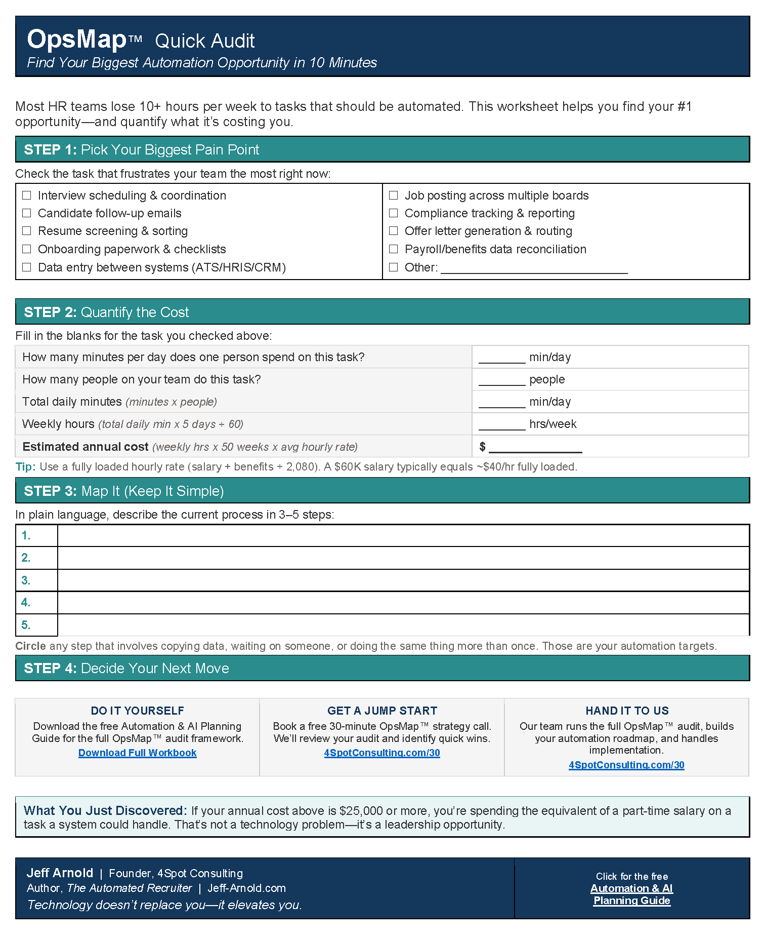
For teams that want to understand the discovery process before committing to an automation build, the OpsMap™ discovery framework provides a structured way to map data flows and identify integration gaps before writing a single line of automation logic.
What Is the Business Case for Proactive HR Metrics?
The business case is direct: every workforce problem that goes undetected until it becomes a vacancy, a skill gap, or a disengagement crisis costs more to resolve than it would have cost to prevent. Research from SHRM places the average cost to fill an open position at $4,129 — a figure that climbs sharply for specialized or senior roles. McKinsey Global Institute research documents that organizations with strong people analytics capabilities outperform peers on total shareholder returns. Harvard Business Review analysis consistently links predictive workforce practices to measurable improvements in revenue per employee.
The TalentEdge case makes the compounding effect concrete. By standardizing HR processes and implementing automated data pipelines that made proactive metrics computable at scale, TalentEdge achieved $312K in annual savings and a 207% ROI. The full methodology is documented in our case study: how TalentEdge saved $312K with HR process standardization.
Beyond cost avoidance, the strategic shift matters for the nature of leadership conversations. HR teams that bring proactive metrics to the executive table present risk maps, demand projections, and intervention options — not retrospective reports. That posture is the difference between an administrative function and a strategic partner. See how automation enables that shift in our guide to strategic HR automation that unlocks B2B growth.
How Does Automation Make Proactive Metrics Sustainable?
The metrics above are not new ideas. What changes in 2026 is the operational feasibility of computing them continuously without a dedicated data engineering team. Make.com scenarios can automate the data pulls, field normalization, and dashboard updates that previously required manual intervention — bringing proactive metric infrastructure within reach of HR teams that lack enterprise analytics budgets.
Jeff’s rule applies directly here: 10 minutes of manual data preparation per day equals one full week of lost productivity per year. For an HR team of three updating metrics dashboards manually, that is three weeks of analyst capacity consumed annually by data wrangling rather than interpretation and action. Automation reclaims that capacity permanently.
For a practical walkthrough of how HR teams build automated data pipelines without developer support, see how a non-technical HR team started building their own automations with Make and AI. For teams considering whether to build in-house or engage an automation partner, the DIY automation versus hiring a Make partner guide provides a structured decision framework.
Expert Take
The most common failure mode in proactive HR metrics programs is not the technology — it is the refresh cadence. Organizations invest in building a flight risk model or a skill coverage dashboard, launch it once, and then let it go stale because the data update process is manual. Automation solves this by making the refresh automatic. A proactive metric that updates itself monthly is exponentially more valuable than one that requires three days of analyst time to regenerate.
Frequently Asked Questions
What is the difference between proactive and reactive HR metrics?
Reactive HR metrics are lagging indicators that confirm what already happened — turnover rate, absenteeism counts, time-to-fill. Proactive HR metrics are leading indicators that predict what is about to happen — flight risk scores, skill coverage ratios, workforce demand forecasts. The practical difference is whether you learn about a problem in time to prevent it or only after it has generated a cost.
Which proactive HR metric should a small HR team prioritize first?
Start with quality-of-hire. It requires data you are already collecting — performance ratings, engagement scores, retention at 90 days and one year — and it produces a metric that directly connects HR activity to business outcomes. Once that data discipline is established, flight risk scoring and eNPS trend lines are natural next steps.
How does automation improve proactive HR metrics?
Automation eliminates the manual data reconciliation that makes proactive metrics unsustainable for lean HR teams. Automated pipelines pull from the ATS, HRIS, and performance platform on a defined schedule, normalize field definitions, and update dashboards without analyst intervention. The result is metrics that stay current rather than going stale between manual refresh cycles.
Is a flight risk score accurate enough to act on?
A flight risk score does not predict individual behavior with certainty — it identifies statistical elevation in attrition probability based on composite signals. The appropriate response is conversation and investigation, not assumption. A manager who knows a team member carries elevated flight risk has a reason to check in, explore development options, and review compensation — actions that are beneficial regardless of whether the employee was actually planning to leave.
What data sources are required to build proactive HR metrics?
The core sources are: HRIS (employee records, compensation, tenure), ATS (source channel, recruiter, hiring manager per hire), performance management platform (ratings, engagement scores, 360 feedback), and compensation system (pay bands, raise history, market benchmarks). Integration between these systems — not the sophistication of any individual system — is what makes proactive metrics computable.
Additional Reading
- Drowning in Admin: How Solo and Small HR Teams Can Fix Broken HR Operations Without Burning Out
- HR Transformation: Practical AI & Automation for Strategic Operations
- How TalentEdge Saved $312K with HR Process Standardization
- The $27K Overpayment: How One HRIS Data Entry Mistake Cost a Manufacturer a Year of Salary
- How Sarah Compressed a 45-Minute Onboarding Process to Under 4 Minutes
- HRIS Required Fields vs Manual Data Validation: Which Is Safer for Small HR Teams?
- How a Non-Technical HR Team Started Building Their Own Automations With Make + AI
- What Is OpsMap? The Discovery Step That Prevents Automation Mistakes
- DIY Automation vs. Hiring a Make Partner in 2026: When to Do Each
- 7 Questions to Ask Before You Automate Anything (The OpsMap Checklist)
- Manual Data Entry: The Silent Killer of Business Productivity & Profit
- Recruiting Automation: Transforming Hidden Costs into Measurable ROI
- AI in HR: From Efficiency Gains to Strategic Talent Advantage
- Beyond Admin: How Strategic HR Automation Unlocks B2B Growth
- 11 Warning Signs Your Inherited HR Operation Is Bleeding Money